News
U.S. State Department Shows AI-Generated Map of Africa With Countries in Wrong Places
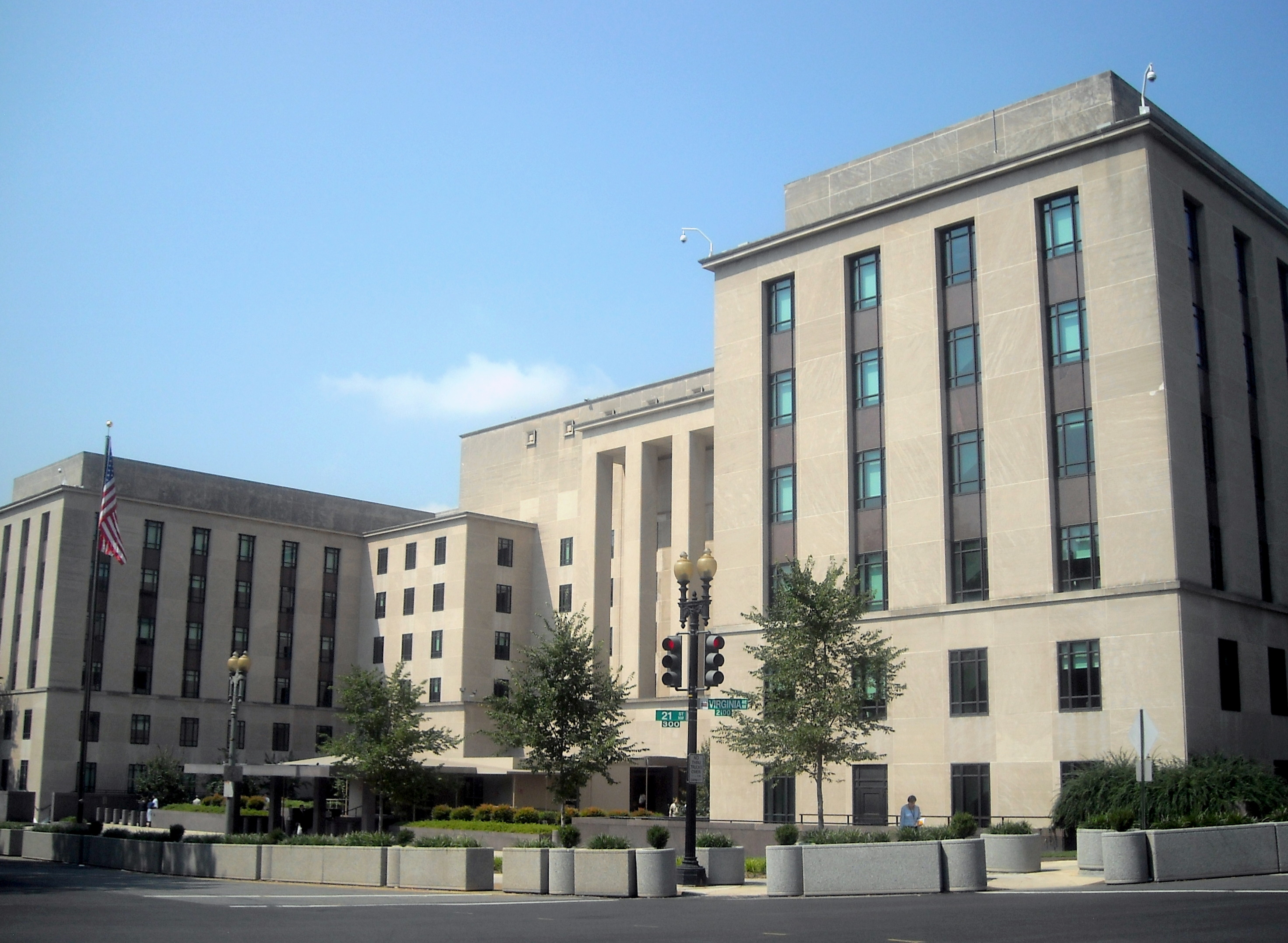
At the 2026 International AIDS Conference in Rio de Janeiro, the U.S. delegation presented a map of Africa with nearly every country misplaced. Analysis showed the graphic was generated using an OpenAI tool.
Contents
During the 2026 International AIDS Conference in Rio de Janeiro, the U.S. State Department was set to present new health agreements under the PEPFAR program. Instead, attention from attendees and media shifted to a slide showing a map of Africa on which nearly every country on the continent appeared in a completely different location than in reality.
What was shown on stage
The presentation was led by Jeff Graham, the U.S. envoy for global health overseeing PEPFAR, the flagship program supporting the fight against HIV/AIDS. The slide was meant to accompany the announcement of new health cooperation agreements with African countries, with senior officials and diplomats from several African nations in the audience.
Instead, viewers saw a map on which the continent's geography had been completely scrambled. Nigeria, located on the Atlantic coast in West Africa, appeared deep in the Sahara. Mozambique, a country in the southeastern part of the continent, ended up on the Horn of Africa, in the region of Somalia and Ethiopia. Ivory Coast was shown on the opposite side of the map from its actual location.
A trace of artificial intelligence
Reuters was first to report on the matter, and its analysis of the slide found a watermark indicating the use of an OpenAI generative tool. OpenAI did not respond to media requests for comment on the matter.
The watermark suggests the graphic was not based on actual cartographic data but was generated by an AI model from a text description, without any check of geographic accuracy. Image-generating models are notoriously prone to problems rendering maps, borders, and labels accurately, which in this case led to nearly the entire continent being rearranged.
The State Department's response
The State Department admitted the error and took full responsibility for it. According to the official explanation, the slide with the map was added to the presentation at the last minute by a team member, just before the presentation began, without time for verification.
The department apologized for the confusion and the inaccuracy of the material presented, including to the African partners present in the room. The mistake did not, however, change the substance of the health agreements announced during the session, which concerned further cooperation under the PEPFAR program.
Whoever created and approved this slide didn't know where African countries were located, and didn't check their work - Matt Petit, Atlantic Council
Criticism and wider context
The incident quickly spread on social media and drew a wave of criticism from Africa experts and foreign policy commentators. Many pointed out that the error occurred at a conference dedicated to public health in Africa, in front of an audience that included African diplomats, which heightened the impression of carelessness.
The case fits a broader pattern in which public institutions and companies use generative AI to quickly produce presentation materials without sufficient quality control. Similar mishaps with AI-generated maps and graphics have affected other organizations in the past, but rarely at such a high-profile diplomatic event.
For public institutions and companies using AI tools to prepare official materials, the incident is a reminder that automatically generated graphics, especially maps and figures, require manual verification before being shown publicly. The lack of such oversight can cost an institution its credibility, particularly in diplomatic settings, where every detail can be read as a political signal.

